I love Lego and I have built a lot of IKEA furniture.
The thing they both have in common is amazing pictures giving you directions. You literally don’t have to be able to read to be able to build either. Below is an example of a set of Lego directions. They are clear, concise, and very detailed, but they are still easy to follow.
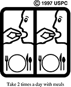
Why do we not have this in healthcare? Proper communication is vital in healthcare. It can prevent readmission and lead to better outcomes. There are some pictographs created by the USP. Below is an example of one of them
As you can see this was created in 1997. I think it is time for a refresh.
The reason I am asking for pictograms in healthcare is because we live in a very connected society and people from all different backgrounds are using our healthcare system. In a recent study, they found that 54% of Americans between the ages of 16 and 74 read at or below a sixth-grade level. We need a more effective way to communicate with each other. They say a picture is worth 1000 words for a reason.
Yes, I understand that this will not solve the communication gap. But it will help it! It shouldn’t be all or nothing. If we can help alleviate any source of stress and inconvenience for someone we should! And pictures are one way to that.
Thank you so much for your support! Please do not hesitate to reach out if you have any questions or leave a comment.
If you enjoyed what you read please consider subscribing and sharing!
I hope you have a great day!


